It’s weird to say, but true— website design and hospitality have quite a lot in common.
Imagine visiting two homes.

The first is straight out of that A&E show “Hoarders.” Junk stacked floor to ceiling in various stages of decay. Clutter like you’ve never seen clutter before. Are some things in the house valuable? Probably —but hard to say for sure. The mess is overwhelming.
You scramble for the door, never to come back.

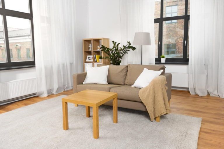
The second home you visit is light, bright and cheery. Well-organized—and it smells like Starbucks! You notice several interesting-looking books and fresh flowers on the coffee table, and you think— “Wow. Someone gave a lot of thought to what I (their guest) might like!” You plop down on the couch, eat some cookies and flip through the books with interest.
You feel at home, so you linger.
Internet Hospitality
The same logic applies to your website. Every person who visits, enters a “room” of sorts that you have set up for them. They will decide very quickly whether to stick around —or bolt!
- Is the information fresh?
- Is there a friendly vibe?
- Can you find what you need easily?
- Is the content helpful and interesting?
- Has someone thought about what you would need, and provided it?
Making members feel “at home” on your website is a goal worth pursuing—especially if your goal is engaging people and building community. If you’d like some practical tips to help make your online house a “home”, take a peek at the following tips for providing a more delightful online experience:


