Setting up a website for the first time can be overwhelming. You’ve been presented with a big, blank canvas to fill with information about your group. What should you include? How should you structure it? Does it really matter all that much?
Yes it does! Let’s talk about it.
Most of us want to feel at ease—especially in the places we visit most. We are drawn to places where our needs are met, and where we feel we belong.
The same applies to websites. If you can remember in the past visiting an ugly, disorganized website, filled with outdated information, you probably also remember the desire to get out of there and never return.
In contrast, there are probably times when you visited a site and instantly felt “at home.” It’s was likely well-organized, so you quickly found what you were looking for, and you also found other things you wanted to explore while you were there. So you lingered. You connected with the minds behind the site. You visited again.
Membership Toolkit has worked with all kinds of parent teacher organizations and has assisted with thousands of PTA websites over the years. We’ve seen it all! And we’ve collected our best tips and practices to get you started or to build on what you already have.
We are about to throw a lot of ideas at you, be selective about what you put on your website though. Don’t feel the need to implement everything. If you do, your website will be huge, hard to navigate, and hard to keep updated. Pick a few of these items to get started so your organization and your members don’t get overwhelmed.
PTA Website Ideas: Examples of What to Include
Using Your Website to Encourage Parent Participation
Make Your PTA website the Information Hub for Your Families
Creating a Clear & Professional Looking Website–How to Utilize Colors & Fonts
PTA Website Ideas:
Examples of What to Include

The 7 Most Important Things to Include on Your Website
1. The Basics
Visitors to your site will naturally want to know who you are — and what your organization exists to do.
Be sure to include:
- Your organization’s name & logo
- Your mission
- Your goals (for the year, or in general)
- Meeting dates & times
- Involvement forms
- Past newsletter

2. Names & Faces
Personal connection is how most people get actively involved in non-profit groups. Visitors need to know your organization is made up of volunteers who are much like them. These things help:
- Letter from your president
- List of board members — and their contact information
Membership Toolkit Tip: Decide with your group if board member information should only be included on a website page that is password protected so only your members have access to this info. This can help prevent phishing scams. You should always have a general email for your organization though that is visible to anyone on your site so they have an email they can use to send questions.
- Pictures of your board
(This isn’t just for the vanity of your board. Seeing faces helps members make connections in real life, and those connections make involvement less intimidating.) - List of committee members
- Open positions on your board or committee chairs

3. Event Calendars
Be a one-stop shop for current information about what is going on in your group:
- Board meetings
- Special events/holidays
- Conference dates
4. Members-Only Pages
Your website is a handy place to keep documents that exclusively benefit your members. However, those files should be posted only on website pages that only members can access.
- Financial reports
- Bylaws
- Meeting minutes
- Secure online directory

5. PTA Events & Programs
When your group puts on an event, make sure members know when & where—and if they are invited! You’ll want to include all the key details in one location:
- Dates of all upcoming programs
- What happens at each program
- Who is invited
- Do you need to sign up & how
- Volunteer needs & how to sign up
6. Awards & Kudos Your PTA has Received
People like to be involved in organizations that have positive momentum. Let members know if you have been recognized for your good work in the community.
- Membership awards
- Recognitions from your school district
- Awards from your council or state organization
7. Quick Links/Important Links
- Councils
- State & National Affiliations
- Helpful resources
- Your school’s & district’s websites
Using Your Website to Encourage Parent Engagement in Your PTA

Your website is the perfect tool to get the word out about all that your organization does while letting people know how they can help, who it will benefit, and where they can sign up. Use it to show what your organization does and how much fun the students – and members – have making it all happen!
Your Website Can Attract Volunteers for the PTA
We all know our organizations would not run without volunteers. Volunteering means giving away your valuable time for free. Most want to know if it is worth it, and whether or not volunteer jobs can fit with their other commitments. Your site should let people know:
- Why do you need volunteers? Being specific here helps your members feel more connected to the job they are needed for and who they’ll be helping.
- What opportunities are available for volunteers? Some volunteers excel at being crafty while others feel more comfortable reaching out to community members. Share all the different ways a volunteer can help out so they can pick and choose.
- Are there “at home” volunteer opportunities? Your members may be very willing to help, but unable to physically come to the school. Highlight certain volunteer jobs that can be done at home so as to include everyone with your opportunities.
Helpful Tips for First Time PTA Volunteers
Doing something new can be scary. Having complete information about what to expect, and what needs to be done ahead of time can help. Make sure to answer these common questions:
- How do I request a background check?
- How do I sign-up to volunteer— and will I get a reminder email?
- Where do I enter the building when I arrive to volunteer?
- Where do I park?
- Do I need my ID?
- Do I need to go through volunteer orientation?
- Is there a volunteer handbook that I need to read?

Make It Easy to Sign Up to Volunteer
Encouraging online sign-ups benefits everyone. It makes it easy for volunteers to research and commit—and it makes it easier for you to manage and encourage those who invest in your vision! Give your volunteers the ability to sign up for:
- Event volunteers— Give them numerous jobs to select from, and a variety of time slots.
- I am interested in doing… Volunteer “Interest” forms allow volunteers to tell you what sorts of jobs they are generally most interested in and thus most likely to sign up for. (Decorating, Event coordination, etc.)
Membership Toolkit Tip: Make sure to utilize the automated reminders feature; because everyone needs reminding sometimes!
Show Your Volunteers Appreciation
Thankfulness goes a LONG way with volunteers! Don’t miss an opportunity to encourage your fellow laborers, and tell them you value what they do.
- Set up automated thank yous— Email your thanks to volunteers a day or two after they help with events and special projects.
- Create a “Volunteer of the Month” page. Include a picture with your kind words.
- Post pictures showing volunteers at work. Choose pictures that include a variety of volunteers and shows your volunteers having fun!
- Inspire volunteerism by posting inspirational graphics.
Make Your PTA Website the Information Hub for Your Families
Now that you have the basics covered, you can add to your site so that it becomes the one-stop shop for all the information your families will need–either directly on the site or through the links you have posted to other important sites. Not everything will be applicable so just choose what information makes sense for your parent group.
School Information
The Basics
Some school websites are difficult to navigate or even find. Consider including:
- Address
- School hours
- Important phone numbers & emails, including the front office and attendance
- Calendar – link to your district’s calendar
- School lunch menu or link to your district’s menu
- Link for parents to make a lunch payment
- Lunch schedule
- Bus schedule
- Parent Portal — to check grades & absences

Celebrate Students
Re-post or link to :
- Student awards
- Student accomplishments
- Club awards and recognitions
- Sports & fine arts competitions

Teachers & Staff
Encouraging staff and keeping a warm connection between teachers and parents is an art. But it all starts with face and name recognition:
- List the teachers & staff
- Pictures of your school administrators
- Principal’s Page
If your principal would like to share something with parents, give him or her a page to do so. This is a great place to share something personal about herself, her family, or her education philosophy and how it impacts the school’s mission. She may encourage parents to support your PTA/PTO, and celebrate past success. Don’t forget to include a picture so parents know who your principal is when they see her on campus. - Teacher Favorites
Provide a list of each teacher’s favorite things. This is a great resource for parents who would like to purchase holiday and year- end gifts. And, it makes the teachers feel special. Publish Teacher’s Favorites lists on website pages that are restricted to members only.

Additional Resources for Students & Their Families
Many families will turn to your site as a resource, either because they are new to the area or their student is the oldest in the family and they are learning as they navigate their way through the wonderful world of parenting. Consider including additional information that might not be directly related to your school or parent group but that your community will find useful.
Community Activities
School life is intimately connected with life in a larger community—especially your city. Consider posting about:
- Free activities and events
- Local libraries, art museums, galleries, science museums, zoos, and sports activities with links to their websites for more information
- How to register to vote
- Dates for upcoming elections
Hot Topics
Parents and kids often need help understanding:
- Bullying
- Healthy Kids
- Special Needs
- Healthy Eating
- Stress & Kids
- Parenting Classes
- Online Safety
- Steroid Use
- Alcohol, Drugs, & Vaping

Membership Toolkit Tip: Include links to already existing resources. Ask teachers and parents what they believe would be valuable to include.
Guides
If your site is a high school site, consider including links to resources that supply information that members are eager to know but don’t know who to ask, such as:
- College Application Tips
- Annual School Activities
- Graduation
- Homecoming Week Traditions
- After School Resources & Enrichment

Recommendations
Ask parents and faculty for recommendations of their favorite activities and create a directory for all parents.
- Tutors
- Athletic programs (competitive and recreational)
- Dance & The Arts
- Science programs
- Summer camps & activities
Academic Pursuits
Many parents are looking for tools to enhance their students’ learning or help reinforce what they are being taught. Ask the teachers for resources that align well with their teaching styles.
- Apps – Kids love to do educational activities disguised as games, which makes “best apps” by grade level a very engaging topic for parents.
- Math – Many parents, even those with Ph.D.s, can feel confused and frustrated by how math is taught. Ask teachers for grade appropriate resources, including: videos, apps, blogs, websites, and games.
- Reading Lists – Ask your librarian for a list of age appropriate books for students. This is especially helpful for summer months. Some school and community libraries also provide a “summer reading challenge” to keep kids excited to read.
- Spelling & Vocabulary Lists – Offer grade-school level lists to keep kids up on their spelling and vocabulary.
- Academic Milestones – Many parents are curious as to what students are expected to know by grade level. Ask your principal or lead teachers for these.
- Attendance Works – Why does it matter if students are in school or to school on-time? Don’t assume that all parents understand the importance. Administrators should set clear expectations and be specific on why attendance matters.

Fundraising and Your PTA--The WHY and HOW
WHY We Raise Money
Fundraising is typically not included in your organization’s list of goals but for many it is a vital way to support your school. Parents and community members want to see their money in action so be specific in explaining what your goals are and what your successes were in the previous years.
- How do students benefit when the school budget is supplemented (class parties, uniforms, technology…)?
- What goals are you trying to reach this year?
- How were funds raised in past years used?
HOW We Raise Money
Let your families and community know how they can contribute.
- Online donations —Include a button on your fundraising & home page to make it easy!
- Box Tops —What should they collect, and how should they turn it in?
- Major fundraisers for the year —Carnivals, Fun Run, Cookie Sales, etc.— and how to participate.
- Spirit Nights —When, Where, & Why!
- Community partners — Many local and national stores offer a percentage back to schools who sign up. Amazon Smile and many grocery stores are two of the most popular. Provide registration or enrollment links for parents and include all the information they will need to link their shopping account to your school.


Sponsors
A great way to raise funds for your parent organization is to ask businesses and families to sponsor your PTA or PTO. Be transparent in the process of soliciting sponsors, and be sure to understand the difference between a sponsor and an endorsement. Endorsements and commercial advertising are not permitted for a non-profit.
Make it easy for businesses to support your organization by including information such as:
- What levels of sponsorship are available, and what benefits are associated with each.
- How to become a sponsor with a link to become one or contact someone for more information.
Then, use your site to include a dedicated sponsor page where you showcase your sponsors with their logos and links to their websites. Want to give them more recognition? Add side rails that show on all of your webpages and thank your sponsors there; that way visitors will see your sponsors no matter where they are on your site.
Membership Toolkit Tip: PTAs and other nonprofits cannot endorse or recommend sponsors, so be sure to include the following disclaimer:
“The mention of any business or service in this publication [or website] does not imply endorsement by the PTA.”
What NOT to Include on Your PTA Website
Some things just do not belong on your website. And all of them have serious potential consequences.
You may be tempted, but don’t:
- Post critical opinions or articles about another organization or an individual.
- Publish pictures and names of students without permission to do so. Some families have good reasons to hide their kids’ faces. Don’t be the organization responsible for helping a violent relative find out where a kid lives.
- Use pictures that are copyrighted that you do not have permission to publish. Copyright laws have teeth these days. When in doubt, leave it out. Get your images legitimately by creating them yourself, downloading them from a free-content publisher, or buying them.
- Post advertisements (which are different than Sponsors).


Create a Professional Looking PTA Website
First impressions last forever and you have a very small window to make sure your members have a favorable impression of your website. The first thing your members will notice is the design of your website–is it clean and inviting, or messy and chaotic? But professional websites also need to be functional and easy-to-use. Does your message stand out? Is it easy to know where you need to click to get what you need?
A professional website needs to LOOK great and PERFORM great by providing engaging content, helpful links, and smooth navigation so your visitors can find exactly what they are looking for.
Fix Your Font
PTA websites are often riddled with visual font chaos. Sometimes it’s “too many cooks in the kitchen”. Other times there are just so many fun fonts out there, how’s a girl to choose?
We’ve been there. We get it!
BUT— poor use of fonts and font colors can create major readability problems for your visitors, and distract them from your message.
Below are 3 major text problems to avoid— and quick-fix suggestions to solve them.
1. The Ransom Note Look
The Problem:
There are TONs of fun fonts to choose from—and it can be tempting to use every one that appeals to you. But the result is what our chief developer calls “the ransom note look”–visual chaos, which distracts from your content.

The Solution:
Use “fun fonts” for logos and important events that you really want to stand out. Otherwise, restrict yourself to 1-2 basic fonts, and use them throughout your website. This will restore visual harmony, and make your “special” content feel special again.
2. Um...I Need a Magnifying Glass to See That
The Problem:
Today, most visitors surf the web on tiny cell phones and iPads—not desktops as in years past. Alas! Perfectly-sized text on your desktop is tiny on your cell.

The Solution:
Switch to a “mobile-friendly” web template. Through the magic of code (which you will never have to see), font sizes and layouts adjust to match the device used to access the site. Which means parents can easily read your content! All Membership Toolkit subscriptions come with a mobile-responsive website template— which you can use, regardless of your technical ability. If you can type an email, you can edit your own site!
3. That Makes My Eyes Hurt
The Problem:
Eye fatigue. The problem is real!
Take a look at the example below. If it seems like too much effort to read, you are in good company! Most of us wouldn’t take the time. The text is small, and doesn’t stand out much from the background. The lines are crowded together, and the paragraphs are long.

The Solution:
Work to make your text easy on the eye!
- Good contrast between the text and the background
- Ample space between lines
- Frequent paragraph breaks
- Easy-to-read font style (san-serif is easier online)
- Thick margins (which means less back and forth eye movement)
Bottom Line: Happy readers stick around longer. So that’s the goal: to make reading a pleasure! You want your members to know what’s going on, and how they can get involved. Make adjustments to your text so that it’s easier to read— to encourage members stay around longer.
Use Colors Wisely
If your school has established colors you may not need to think about color options much. If you are the Pasadena Eagles PTO, for example, it makes a sense to reflect the school’s red and gold color palate.

Or, if your school is called Verdant Valley Middle School, odds are, at least one of your colors will be some shade of green.
But for many groups, color options are wide open— which is both fun and challenging. Below are some tips and fun tools to help you in your selection process. The goal is to narrow the universe of color down to 2-3 colors— ideally 2 colors and an accent color—and then stick with them. Over time, members will come to associate those colors with your group, building, community, identity.
The Psychology of Color
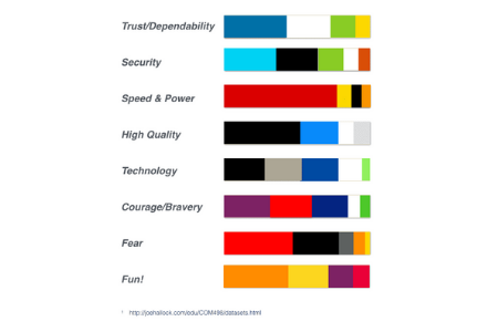
As you begin, it’s helpful to know what emotional and psychological ideas people associate with color. Studies show that when asked what colors remind them most of Power and Speed, for example, 76% thought of “red” first; 7% yellow, 4% black, etc.
So if the Pasadena Eagles want to be seen as fast and powerful— red, yellow and black are good choices, because they correspond with how people already visualize speed and power.
Purple is the primary color of the Watch Dogs site. An unusual choice for a men’s logo. However, purple is the top color when courage and bravery are discussed.

Colors That Energize | Colors That Calm
The spectrum of color can be broken into “warm” and “cool” colors. Warm colors radiate fun, active energy. If your group is high energy and fun, go for the warm colors.

Cool colors have a calm, dependable, steady feel. If you want to show that your group is wise and steady, cool colors may make a lot of sense.

And either group can be mixed and matched at will with neutral colors— white, black, grey, tan. The lighter the color, the more open and free the space will feel. The darker the color, the more closed it will tend to seem.

Let’s see what this looks like in practice.
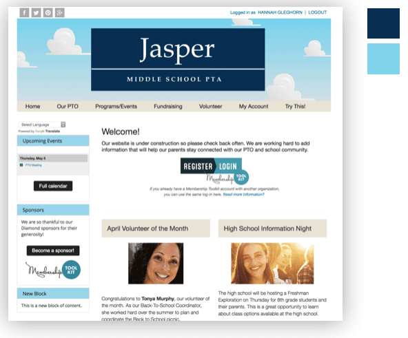
Jasper Middle School is a calm, easy-going place. So they selected cool colors, mixed with neutrals. Choosing colors that are similar creates an easy, comfortable feel.
If Jasper wanted to put out a warm, high-energy vibe, they could have gone with “warm” colors, like orange and yellow.
High Impact
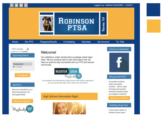
Another way to go is “high impact”. This is achieved by using colors that are opposites—and it creates tons of visual punch. “Complementary” colors are colors that are opposite from each other on the color wheel.
Yellow & purple…
Blue and orange…
Green and red*…
These colors fight with each other visually, and create high impact.
*Membership Toolkit Tip: Beware of using green and red. People with color blindness cannot tell the difference between these two colors.
Favorite Colors: Men vs. Women
Knowing your audience may greatly affect your choice of color. Regardless of gender, blue is most people’s favorite color, and green is right up there. Both genders also like red and black. Women’s second favorite color is purple—not true for men!—which is why purple is an interesting choice for the Watch Dog Association.
Interestingly, neither gender is particularly fond of grey, brown, yellow, or orange.

Go With Your Gut
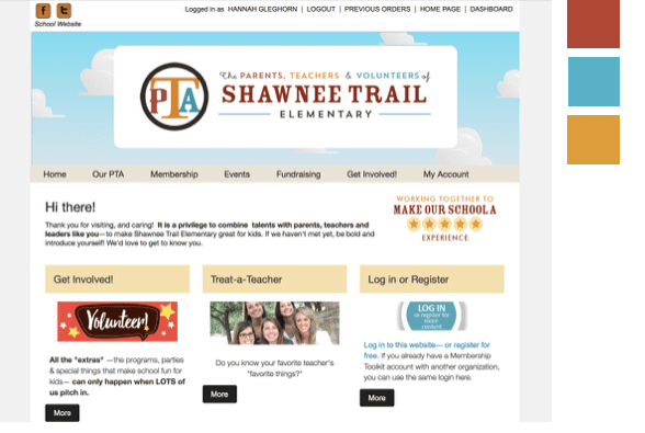
Sometimes you have to go with your gut to come up with a color strategy that works for your unique group. For example, Shawnee Trail Elementary was drawn to “primary colors”— red, yellow and blue. But they also wanted to honor their school’s “wild west” past. The solution for them was to mute the primary colors to achieve the “western” feel they wanted, while still keeping it kid-friendly and clean feeling.
Use Some Fun Tools
Now that you know the color basics, you can use fun tools like this one.
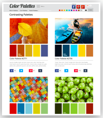
ColorPalettes.net starts with beautiful photos, and builds color palettes based on them. If you want your site to feel like fall, choose a fall photo, and try out the colors they recommend on your site. You can explore warm colors, cool colors, contrasting palettes, and more.
Hexadecimals
Time to get geeky! To use specific colors on your website, you will need to figure out it’s “hexadecimal” number— a number/letter code that websites use to display colors.
One way to find the hexidecimal color is to use Imagecolorpicker.com. Let’s say I like these colors which I found on ColorPalettes.net

I can save the photo to my desktop, then upload it in ImageColorPicker.com to find those values. For the image above, I learned the 5 colors in hexadecimal values are:
#0B2035 #1C629E #B4E1F6 #EFF4F7 and #276452
Have fun testing your color combinations on your Membership Toolkit website!
What Can White Do For You?
For a color —and there is debate whether it even IS a color—white has some serious hidden super powers.
- Want members to volunteer for an event?
White can help! - Want to lead visitors deeper into your website?
White can help keep them engaged.
“White space” refers to the parts of a page which have no text or pictures on them. “White space” bothers some people. They can’t bear to see empty space and not fill it. But, professional designers use white space in very purposeful ways— which you can mimic to achieve certain ends.
Learning From Google
Take a look at this web page. What is the first thing you see?

The word “Google” and the search bar right?
Let’s say you came to Google to find a “Death by Chocolate” cake recipe your PTA president was raving about. Few distractions stand between you and that task.
You visit the page, locate your recipe in under a minute… and before you can say “Wild Thing!” you are licking fudgy goodness off a spatula.
Ta-da!!!! That’s white space at work for you. “White space” helped you stay focused. You did what you came to do, and got what you wanted.
But that’s not white’s only trick!
Learning From Yahoo
Now let’s look at Yahoo’s landing page.
What is the first thing you see?
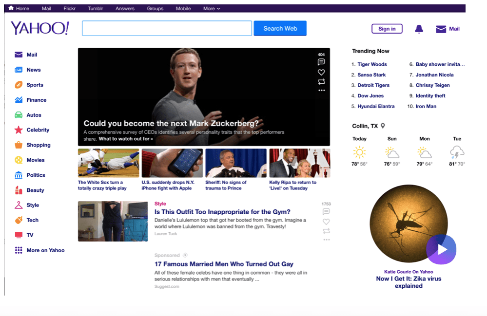
That is a tougher question. BUT…. You almost certainly noticed the image of Mark Zuckerberg first (since it is the largest, most complex thing on the page), and the mosquito picture (which is 2nd largest). You then noticed other pictures on the page, the weather icons, and you read some captions.
But wait! Did you notice the search bar at all?
You may have visited Yahoo with “recipe finding” on your mind, but odds are you quickly became distracted. Roughly 45 minutes after visiting Yahoo, you may find you know a lot about viruses, Mark Zuckerberg, the weather, and outfits for the gym… but nothing about how to make “Death by Chocolate” cake.
You came looking for one thing, but left with something else.
Boiling It Down
Both Google and Yahoo use white space well— but with different purposes in mind.
Google honored your goal to get a recipe, and used white space to keep you “on task.”
By contrast, Yahoo used your recipe-finding goal as an opportunity to lead you to information you were not looking for. White space hid what you came for (the search bar), and provided a grid to hold pictures and stories— intended to lead you away from your goal, and deeper and deeper into their site.
Pinterest works on a similar principle. You go there looking for one thing… and spend hours finding other things instead!
Putting "White" To Work
Odds are you will find both approaches useful at different times. For instance:
Let’s say you want your members to complete a volunteer sign-up for an upcoming event. Take a tip from Google. Provide them a page with no distractions. Keep them focused until they are done signing up. Then you can distract them. The same would apply to purchases. Keep them focused until they are done checking out.
With most other pages you can mimic Yahoo’s approach. Drive members to your site using information you know they are eager to get, then provide additional links to draw them deeper into your world.
Be wise with those links though! Clutter cancels out the power of white space! Make sure to keep your site tidy—and use your powers for good.
Make Sure Your Website is User-Friendly and Easy-to-Navigate
Now that you have great ideas in mind, it’s time to get organized. Your website “navigation” is a great place to start. Try to think of it from the perspective of a first-time visitor. What are they looking for? What do you want them to do? Make it easy for visitors to find and do things on your site. Take the time to organize your navigation menu so that it is intuitive to your guest – if they can’t find what they are looking for, they won’t stick around.

Making members feel at home on your website is a goal worth pursuing—especially if your purpose is engaging people and building community. Be sure to include the basics, along with the other aspects that are most important to your organization. Keep your site clean, easy to navigate and read and you’ll soon find that your membership base is growing, your volunteer slots are filling, and your community is feeling informed and connected!
Additional Resources to Make Your PTA the Best it Can Be
Now that you have a PTA website that is your community’s information hub, we thought you might enjoy some of our other resources to help make your parent organization that best that it can be.

